Options spread betting involves buying or selling an asset at an agreed price (called a strike price) on or before a specific date. You can use different options trading strategies using call and put options to profit from rising or falling markets. While these options are similar, they may vary in terms of strike price, expiry date, or both.
Options contracts differ depending on the derivative product you are buying or selling. 100 units represent a contract for shares, while each forex option contract consists of one lot (I.E. $100,000).
What Is The Difference Between Spread Betting vs Options?
The key difference between spread betting and options is that spread betting allows you to bet on the price direction of an asset without owning the underlying market.
An options contract allows you to buy an asset at the agreed price if the financial market price increases within a set timeframe. Since you have the ‘option’ of buying or selling, you have flexibility and reduce your risk.
Another difference is that spread betting is exempt from paying capital gains tax on your profits, while with options trading, you pay it.
Below, I’ve broken down the differences:
1. Expiry date
Spread betting technically has no expiry dates, as you can keep a bet open for as long as you want, while options have an expiration date built in. Options can expire at different times, and these are:
- End of day
- End of week
- End of month
- Quarterly
2. Asset classes
Both options and spread betting have a wide range of asset classes available, although I’d say spread betting has access to a larger range of markets overall.
*Spread betting options are unique to IG Group and Spreadex however are not available for all financial markets.
Product
Options
Spread Betting
Spread Betting Options*
Stocks
Yes
Yes
Limited (US Stocks Only)
Forex
Yes
Yes
Yes
Commodities
Yes
Yes
Yes
Indices
Yes
Yes
Yes
Bonds
Yes
Yes
No
ETFs
No
Yes
No
3. Ownership Of Assets
Spread betting and options are derivatives of an underlying asset, meaning you do not own the assets. With options trading, you can use the contract to acquire the physical shares or commodities if you wish to, spread betting doesn’t offer this option.
4. Medium Of Exchange
Options contracts are exchange-traded and settled through a clearing house like the Chicago Board Options Exchange (CBOE). Spread bets are over-the-counter (OTC), a direct transaction between you and your broker.
5. Trade Sizes
With spread betting, you have better control over the trade size, to place a bet, you simply enter how much you want to risk per point the market moves.
Options trade sizes are in lots, and the value varies between the different assets. For example, in share options, the trade size is 100 shares per option, while in forex, the trade size is $100,000 (one lot).
Since spread betting does not use lots, it is easier to understand risk and profit potential.
Summary of Differences Between Options and Spread Betting
| Feature | Options | Spread Betting |
| Does the product expire? | Yes | Technically yes, but you can keep the position open for as long as you want. |
| What financial markets can you trade? | Forex, Indices, Commodities, Shares | Forex, Indices, Commodities, Shares, ETFs, Bonds |
| Do you own the underlying asset? | No | No |
| Is the product exchange traded? | No, OTC | Yes |
| Can you control the trade size? | No, all options are traded in lots | Yes, by choosing the bet size |
What Is Options Trading?
Options trading gives you the right, but not the obligation, to buy or sell an asset at an agreed price (called a strike price) on or before a specific date. When you buy an option, you’ll pay a premium to take out the contract, allowing you to profit if the market moves in your favour.
You can also sell options when markets are trading in a range or are falling, which is useful as you can collect the premiums upfront in low-volatility markets.
When you purchase an option, you have limited downside (your premium paid) and unlimited profit potential, whereas selling options gives have unlimited downside and limited upside (your maximum profit is limited to your premium).
There are two option types:
- Call options: use these if you think the asset’s price will rise
- Put options: use these if you think the asset’s price will fall
| Type | Buying options | Selling options |
| How to profit |
Call option: When the market rises above the strike price
Put option: When the market price falls below the strike price. |
Call option: When the market doesn’t move above the strike price
Put option: When the market doesn’t move below the strike price |
| Risk profile | Unlimited profit potential, limited risk. | Limited profit potential, unlimited risk |
Examples Of Options Spread Betting
Below, I will go through different examples of spread betting with options:
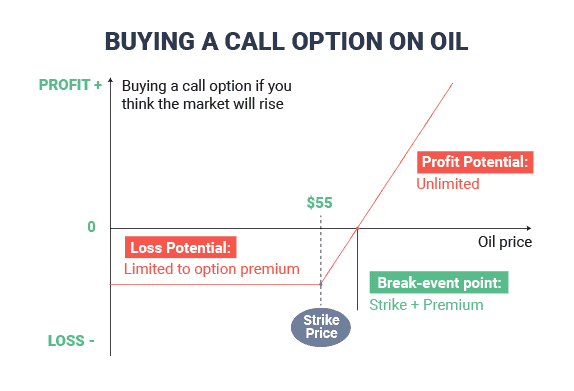
1. Option Spread Bet Going Long Call Example
You buy a call option in oil because you think the underlying market will rise before a specific date.
Scenario 1: The underlying asset for oil falls below the strike price at expiry. Since you choose not to take the option, you only lose the premium you paid when setting the strike price.
Scenario 2: The underlying asset for oil rises above the strike price at the expiry date, so you activate the option. You will profit as long as you close the bet when the price of the underlying asset is below the strike price.
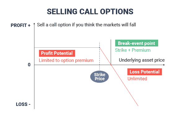
2. Option Spread Bet Going Short Call Example
If you sell a call option, your view is that the markets will not go higher than the strike price; this allows you to collect the premium from a bettor who purchases the call option.
If the option expires below the strike price, you keep the premium. Should the market rise above the strike price, you’ll lose your premium and the difference between the market price and the strike price.
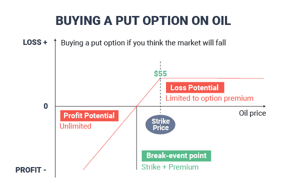
1. Option Spread Bet Going Long Put Example
When you go long (buy) a put option, it means you think the asset will continue to fall, and you’ll make a profit the further the price falls from your strike price.
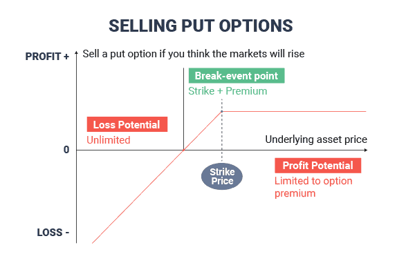
2. Option Spread Bet Going Short Put Example
Selling a put option is when you think the markets will not go lower than the current strike price.
By selling the put, you collect the premium and wait until the option expires, and if the price of the market is above the strike price, you’ll keep the premium as profit.
If the market falls below the strike price, you’ll lose your premium and the difference between the market price and the strike price.
What Are The Pros And Cons Of Options Spread Betting?
There are pros and cons of using options spread betting that you should consider before using them.
Spread betting provides many advantages, like tax-free profits and combining them with options that offer limited risk and unlimited profit potential – making it a versatile tool to trade the markets.
Below, I’ve noted the pros and cons of options spread betting:
| Pros | Cons |
| Built-in risk management by only risking the premium paid for the option | Cannot write your own options |
| Volatility can potentially increase your profits higher than the underlying market moves. | Wide spreads to open a spread bet on an option |
| Do not have to pay tax on profits | Can be a complicated product for a beginner |
| Collect premiums upfront from selling options | Lack of broker availability (only IG Group and Spreadex offers them) |
How Do You Spread Bet With Options?
Learning how to spread bet with options has been simplified through platforms offered by IG Group and Spreadex, which provide options markets. Below is a quick guide to placing a spread bet with options.
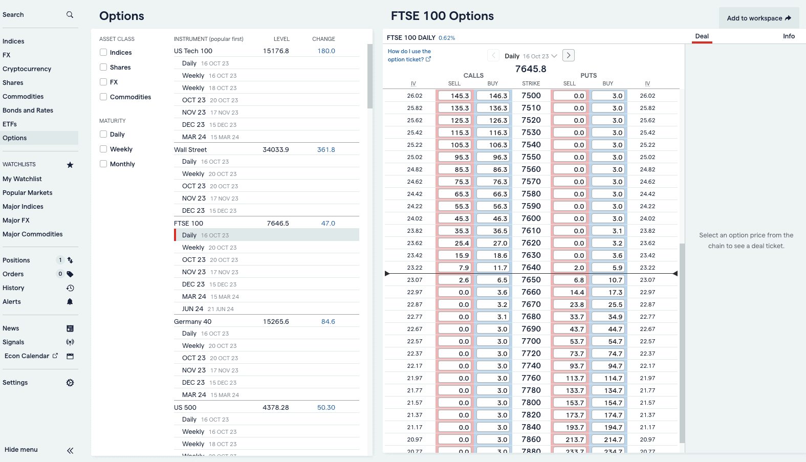
1. Pick Your Market
Choose the market you want to bet on, which can be a choice between indices, shares, forex, and commodities. Then, choose the expiration date of the option you want to spread bet on.

I have chosen the FTSE 100 Daily expiring 20th December 2023.
2. Choose Whether To Buy or Sell a Call or Put Option
Next, choose how you want to speculate on the FTSE 100’s price movements. Then click on the price of either the put or call option. You’ll have to pay this premium to open the option spread bet.
3. Select The Strike Price
Here, I have chosen to buy a put on the strike price of 7640, meaning if the FTSE 100 closes below 7640, I will have made a profit.

The price is 14.40, so if I bet £1 per point, it will cost me £14.40 to open the spread bet option. This is also my maximum loss, so even if the market moves to 7670, I will still be in the option and capped at a £14.40 loss.
4. Enter Your Bet
Click the buy button at the £14.40 price and enter the bet size (I put in £1 per point). This shows that I need a margin of £14.30 to open the spread bet.

Click place deal, which will execute the bet.
5. Wait until expiration (or close out early).
You can wait until the expiration and see if the market is below the strike price of 7640 – if it is, you’ll make a profit. If not, you’ll lose £14.40.
It is possible to close the option earlier than the expiration date to capture any profitable moves early. For example, if the FTSE 100 plummeted to 7500 prices, you can close the bet early and take the profit.
What Markets Can You Spread Bet With Options?
Options spread betting offers a variety of markets to speculate on; these include:
- Commodities – including gold, silver, US Crude Oil, and Natural Gas
- Indices – such as NASDAQ, FTSE 100, DAX 40
- Currency pairs – including GBP/USD, USD/JPY, and EUR/USD
- Shares – limited selection but includes Tesla, Amazon, Apple, and Meta
What Strategies Can You Use For Options Spread Betting?
Spread betting on options also allows you to create specific strategies that can help in different market events, lock in profits if the markets don’t move, collect premiums from other options traders, and more.
Below, I’ll share an example of a spread betting strategy on options:
Straddle.
This is a strategy where you spread bet on a call and put option with the same strike price and expiration date of the underlying asset.
The idea behind the straddle is that you can profit if the asset has a large movement up or down, but you’ll lose both premiums if the asset doesn’t move.
Straddles are ideal around high-impacting news such as the NFP, where the EUR/USD can quickly surge upwards on positive data (or plunge on bad news).
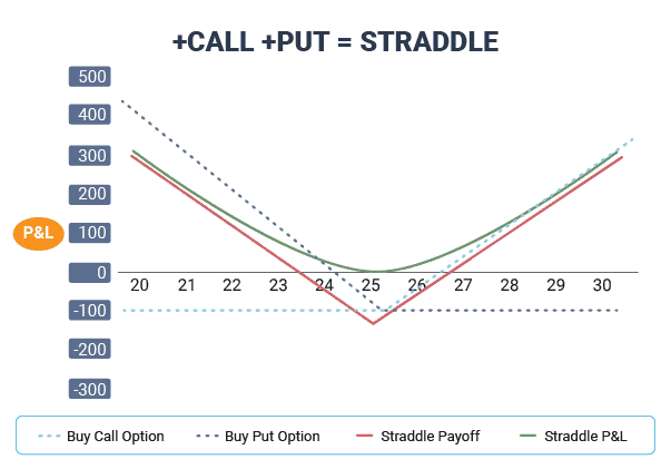
This is just one of many ways you can use options to hedge, lock and profit from markets rising, falling, or barely moving.
Which Broker Is Best For Options Spread Trading?
IG Group is the best spread betting broker for options and offers over 30+ options markets, including shares, indices, commodities, and forex options. The broker offers a decent options trading platform that is easy to navigate and execute your spread bets.
SpreadEx is an alternative choice of options spread betting that also offers sports spread betting. The proprietary spread betting platform has many top features that can help analyse the markets.
What Are Spread Betting Options vs Binary Options?
Spread betting options and binary options are often confused as the same product, while both offer similar features, they are different. Binary options are simplified options and ask you a “Yes/No” question (hence a binary option) if the price rises or falls within a specific time frame.
Note: As of 2019, the Financial Conduct Authority banned binary options for retail traders.
FAQ
Is Options Better For Spread Betting Or CFD Trading?
Options are suitable for both spread betting and CFD trading; however, with spread betting, you get the added benefits of betting in GBP (no currency fees) and tax-free profits.
Can You Trade Forex Options?
Yes, you can trade forex options with spread betting, but you are limited to only the forex majors, which include EUR/USD, GBP/USD, and USD/JPY.
Is Options Spread Trading Suitable For Beginners?
Spread betting options are suitable for beginners because they have built-in risk management where the price of the premium is the maximum you can lose. No matter how wrong you get the options bet, you’ll never lose more than the premium.
Is Options Trading And Spread Betting The Same?
Options trading and spread betting are the same to a degree as they are financial instruments allowing you to speculate on an asset’s price movement without owning the underlying market. However, both have their unique features. For example, spread betting is tax-exempt.


